Is it an AI photo or Not?
Beauty Isn’t Proof
I’m growing frustrated by the number of people who can't recognize AI.
There are some bad actors who use AI to manipulate, for the sake of views or click engagement. There are others who use AI to create parody or satire. It’s really obvious to me that people are inadequately trained or equipped to identify the difference.
And I’m not saying that from some ivory tower of digital superiority. I’m saying it because the consequences are starting to feel… real. Not abstract. Not theoretical. Real harm. Real confusion. Real mistrust. Real people getting played.
What bothers me most is that a lot of the content is genuinely beautiful. Sometimes it even “represents” something true. But beauty isn’t proof. And representation isn’t the same thing as reality.
It’s getting harder for people to tell the difference. And it’s getting easier for the algorithm to reward whoever cares the least.
Let me give you three examples.
Example 1: The Northern Lights (and the Engagement Harvest)
The northern lights were in the news, because they were visible over some parts of the US that they typically aren’t.
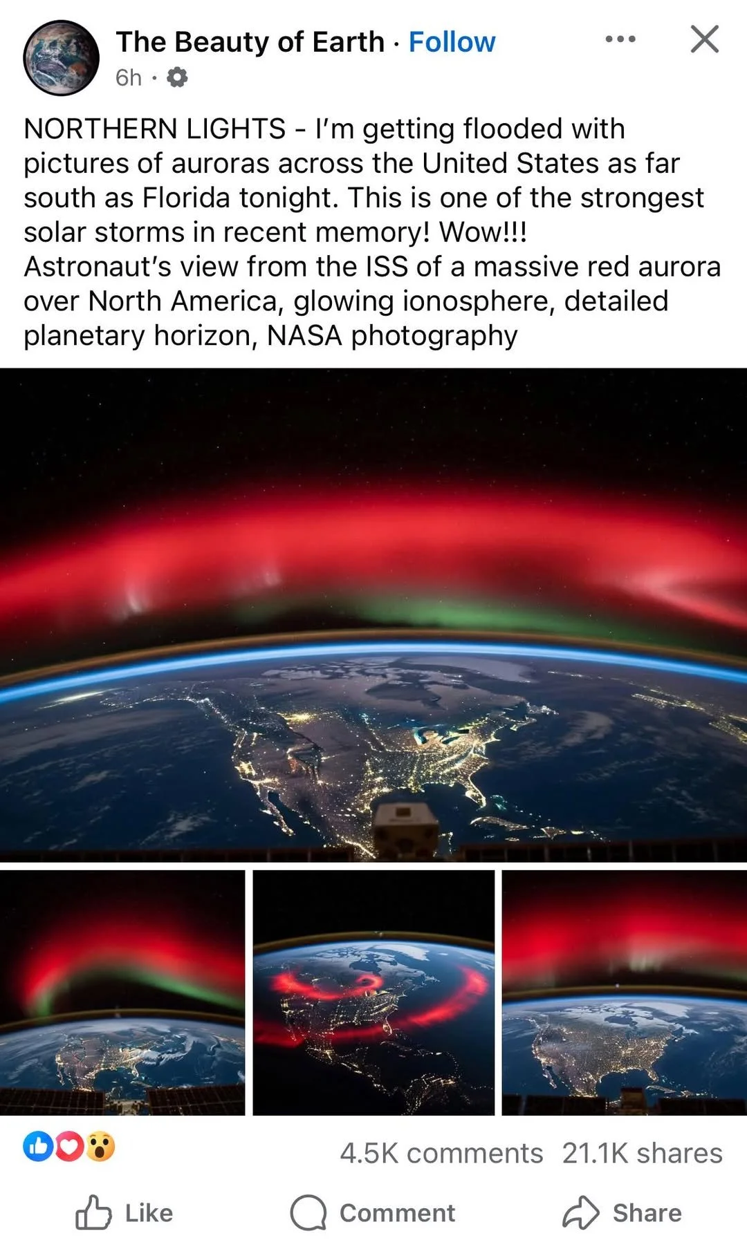
I saw a post from an account (which I don’t follow, but was recommended by the Facebook algorithm, which is a whole other point of frustration) that showed a beautiful photo of the northern lights. Super vibrant, in a stunning display, taken from the ISS over the United States. Shared over 20,000 times.
I suppose one could share it simply for thinking it was beautiful, even if they knew it was AI. But the comments didn’t indicate that.
The photograph seemed too good to be true. But also, not true at ALL if you knew even a little bit about geography. Two things for me jumped out right away. I know of no big cities in the Appalachian Mountains. And that megatropolis in west-central Canada is definitely not Vancouver.
Then I did what I wish more of us would do: I slowed down and looked at how the post was presented.
Maybe more telling, and this is applicable for discerning every post you see online, the profile that shared the images did not credit ISS or NASA with a share from the ISS or NASA page or a tag. Neither ISS or NASA posted anything from their own profiles. This immediately suggests misinformation at best, malinformation at worst.
And here’s where the intent starts to matter.
Because the intent of the poster (even if the photos were real) was to harvest engagement for self-serving gain.
A quick review of the profile account, and every post was a similarly generated photograph. I copied the post’s caption and pasted it into ChatGPT, which generated a near replica of the original post.
Even the caption read like a prompt. Keyword-y. Like someone describing what they want an image generator to make: “glowing ionosphere, detailed planetary horizon, NASA photography.” It didn’t read like a person sharing a moment. It read like someone ordering a vibe.
And the image itself didn’t hold up under attention:
- The caption reads like a prompt. “glowing ionosphere, detailed planetary horizon, NASA photography” is weirdly keyword-y — like someone describing what they want an image generator to make.
- City lights are too perfect and map-like. Crisp borders/coastlines, uniform brightness, and basically no cloud interference. Real ISS night shots usually have more mess: haze, uneven exposure, motion smear, cloud cover blocking lights.
- Stars vs exposure doesn’t add up. You’ve got a nicely speckled star field and super bright Earth lights/aurora with sharp detail. In real orbital shots, you usually pay a price: blown-out highlights, fewer stars, or motion blur/trails.
- Aurora looks airbrushed. That red band is a smooth gradient “paint stroke” across the horizon. Real aurora (even red) tends to have more structure/variation, not a perfectly clean, uniform arc.
- The thumbnail variations are a giveaway. One of the smaller images has a dramatic red “swirl/ring” over the continent — that’s way more like AI “cool factor” than physics/camera reality. Also: three different aurora shapes presented like a set, same vibe/angle… classic generated batch.
Fake account, fake AI generated (though beautiful…), WILD adoration and high click-rate.
So I keep coming back to the same question:
Who is benefiting from this, and who is not?
Example 2: The Flood Photo (and the Theft of Real Pain)
After the horrible storm and flooding in North Carolina, there were plenty of AI generated photographs floating around social media. Were they from bot accounts or real people? I’m not sure.
I help manage the Ginghamsburg Facebook page, but I couldn’t until my personal profile was verified. We used to have a shared account, though, which multiple staff could log in, called “ginghamsburg assist,” but that account was inaccessible once Facebook required proof of ID.
So on one hand, how are there seemingly SO MANY bot accounts behind bullcrap pages? On the other, are there actual real people hiding behind these click bate profiles?
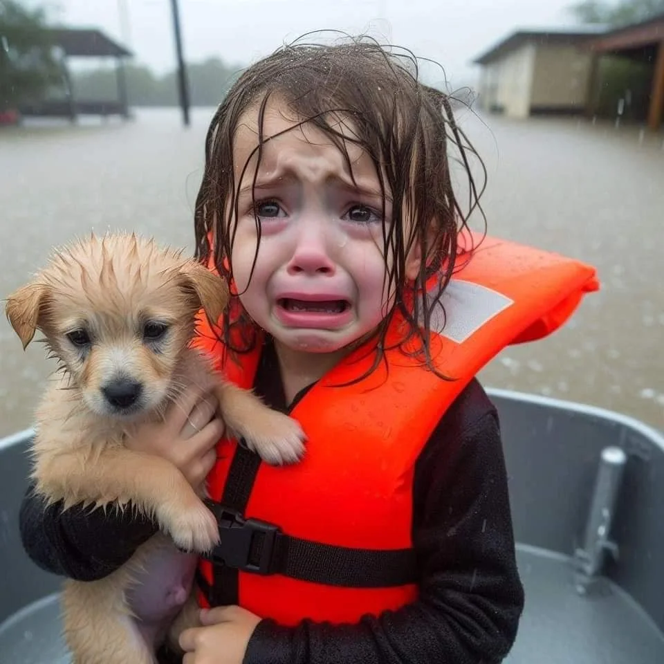
What’s more, is that some people were calling for this photo to win a Pulitzer prize.
Oof.
What a slap in the face for the photographer to realize people can’t actually recognize why a photograph is good or artistic at all, told by the fact they can’t instinctually recognize AI generated BS.
And beyond the insult to artists, there’s a deeper harm: most people are probably learning about catastrophes FIRST from accounts that try to capitalize on actual news, by misrepresenting it, if only to be first in line to inform the public. The reward is cash by way of engagement through algo-recommendations.
It does a “good” service by alerting people quickly, though not 100% honestly, of a real tragedy that you should know and care about.
That’s the tricky part. The image was a representation of something that happened, though the photo itself is not a real-time capture of a real event.
So what do we do with that?
Well, how about a courtroom drawing meant to represent the emotion of the accused? Or for that matter, a song? Or an album cover that represents songs that represent emotions or stories or events? What about journalism bias that’s caked into every article representation of realtime events?
Art will be art.
There’s plenty of art that represents truth, but at face value is not true. Truth is typically somewhere beneath the surface of something. That’s why the hunt for motive needs to go beneath the surface.
Manipulating the public to gain a quick buck by taking advantage of real peoples’ pain is completely immoral.
But so is the laziness of accepting an image as automatically true.
Photoshop has been around for 30 years! You would think people would understand the language by now.
And if you want a few practical “tells,” here’s what jumped out to me on the “girl with the puppy” image:
- The hand/fingers are “mushy.” The kid’s gripping hand doesn’t resolve into clean knuckles + finger separations — it kind of melts into the puppy’s fur/body the way diffusion models often do.
- The mouth/teeth area is anatomically vague. Inside the open mouth you don’t get crisp, believable tooth shapes/gum lines—more like a dark gradient with “suggested teeth.”
- Life jacket details look too simplified. That gray reflective patch reads like a flat polygon without realistic stitching/edge seams, and the jacket surface lacks the normal construction cues (seams, fabric grain, label bits) you’d expect at this distance.
- The strap/buckle region is weirdly formed. The buckle/strap geometry doesn’t quite “mechanically” make sense—edges and alignment feel off, like the model understands “there should be a buckle” but not how it’s assembled.
- Water/rain cues feel stamped on instead of physically consistent. Droplets on the jacket look more like repeated texture marks than random bead sizes + directional streaking; plus the tear drop on the cheek sits a bit “perfect” without a convincing trail/interaction with skin texture.
None of that means you’re dumb if you believed it. It means we’re being trained to react instead of observe.
And we’re being rewarded for sharing before we understand.
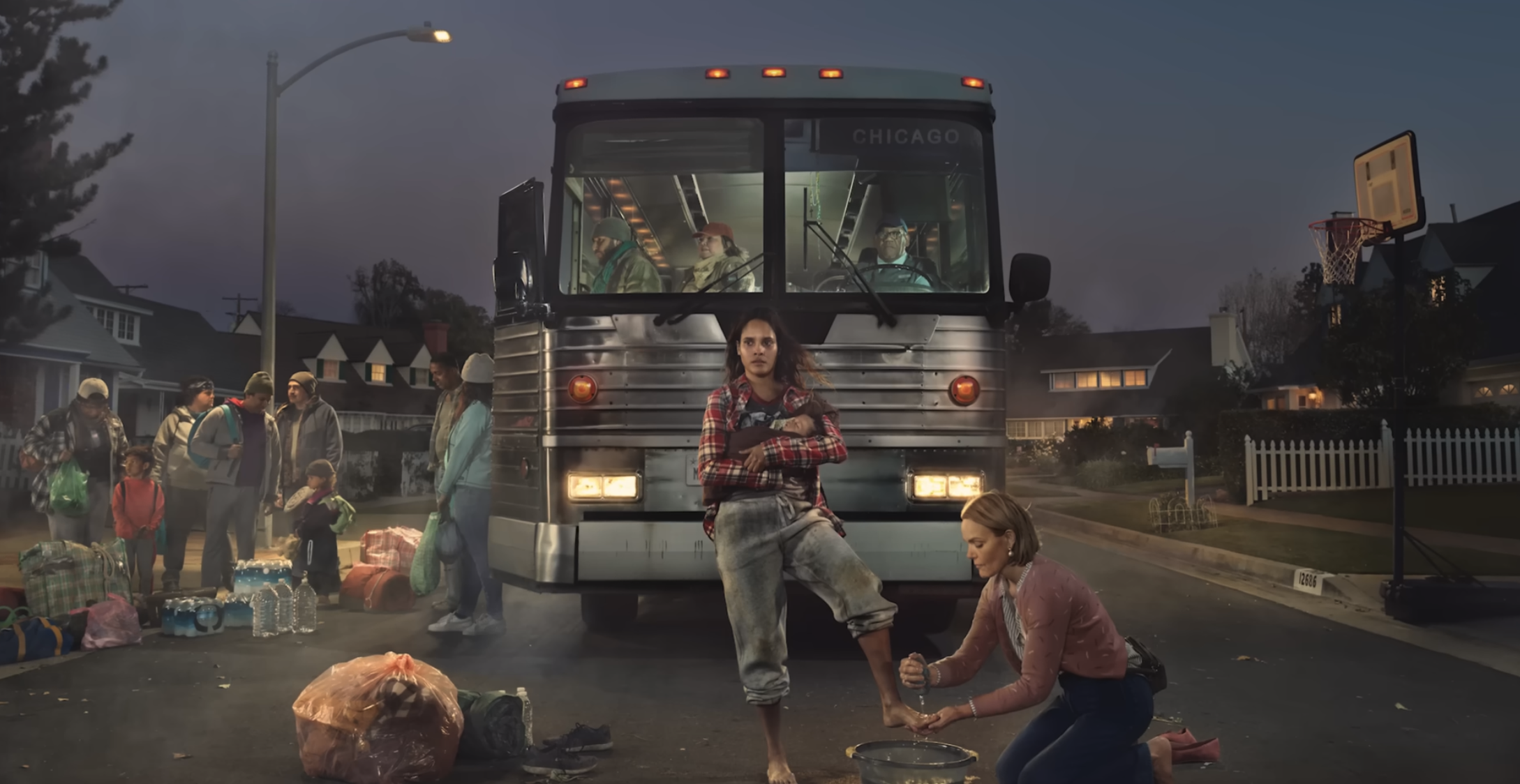
Example 3: When Real Art Gets Dismissed as AI
During the 2024 Super Bowl, I really loved the “He Gets Us” ads that portray values of Jesus through strong imagery.
The HDR still photographs were stunning. High on texture, story, detail... excellent framing, lighting, choice of lens, aperture and style.
But people wrote off the message, authenticity and craft of the ad because they thought the images were generated by AI.
AI got the credit for something an actual photographer painstakingly created, and as a result, the ad’s message was scrutinized and weakened.
When did we get to the point of saying, “wow that photo is amazing it must be AI because no human could do that”?
Do we discredit ourselves so easily?
It’s the same problem as example 1: a lack of effort to observe the obvious. In the first examples above, you can appreciate the beauty without observing its authenticity. Beauty is a value of truth. So the photo is true in that it is beautiful. But its geographical inaccuracies are a dead giveaway to its non-genuine origin.
The same can be said for the High-Dynamic-Range photographs in this ad. They are stunning. You can appreciate their beauty without observing their authenticity.
But the intentional framing and attention to detail are a dead giveaway.
Here’s what I mean. When you zoom in, reality resolves:
- Hands/feet/water behavior looks physically right. The kneeling person’s grip, knuckle structure, and the water droplets/splashing have believable physics (AI usually gets “watery confetti” or mushy fingers).
- Text is clean and consistent. “CHICAGO” on the destination sign looks like real signage: correct alignment, legible edges, no gibberish/letter-morphing (still a common AI fail point).
- Metal + glass reflections behave coherently. The bus windshield reflections, the interior lighting, and the specular highlights on the ribbed metal front all feel consistent with actual camera optics.
- Fabric texture + wear looks non-random. The denim scuffs, plaid pattern continuity, and stitching cues look intentional and repeat correctly across folds (AI often warps patterns at seams/folds).
- It has “production lighting,” not “AI lighting.” The subjects are lit like a set (soft key, controlled contrast) and the background is allowed to fall off naturally. That’s a real-cinematography look—AI images often have lighting that’s too globally even or inconsistent across objects.
AI cannot yet mimic the human touch or soul.
Julia Fullerton-Batten was the photographer. Look her up and appreciate her artistry. Allow her sweat equity and artistic struggle to make the message of the ad ring more true.
Because this matters too: if we keep lazily labeling excellence as artificial, we don’t just get fooled by fakes—we start distrusting the real.
I hope young people revolt against it all.
Not with cynicism. With discernment. With patience. With the kind of attention that refuses to be manipulated.
And I’m not even against AI! I used it to help me write this blog. It’s an incredible helper. It can help me do good things and it can help me do bad.
As humans, we need to be quicker to recognize the bad and stop pouring fuel on the fire.
The test I’m trying to apply is simple:
Does it have a credible source trail?
Does it hold up when you zoom in?
Does it feel like it’s asking you to think… or asking you to react?
And maybe the biggest one: who benefits if I share this right now?
Because the algorithm is always rewarding something.
The question is whether we’re going to keep rewarding the people who exploit our attention, our outrage, and our compassion… or whether we’re going to become the kind of people who slow down long enough to see what’s actually there.
Truth is typically somewhere beneath the surface of something.
So let’s go beneath the surface.
Let’s learn the language.
And let’s stop feeding the fire.
My prompt for the feature photo (credit ChatGPT 5.2): "Astronauts view from the ISS of a masive red aurora over North Amerifa, glowing ionosphere, detailed panetary horizon, NASA photography." Sound familiar?