

My Ideas for the Tipp City Schools Visual Identity Refresh
Tipp City Schools asked for community feedback on the refresh of the district’s visual identity. As a local designer with two children currently enrolled in Tipp City Schools, I thought it would be fun to do two things:
Visualize the most practical solution to unify the district’s brand across all of its schools.
Wipe the slate clean and develop a visual identity system for Tipp City Schools from scratch.
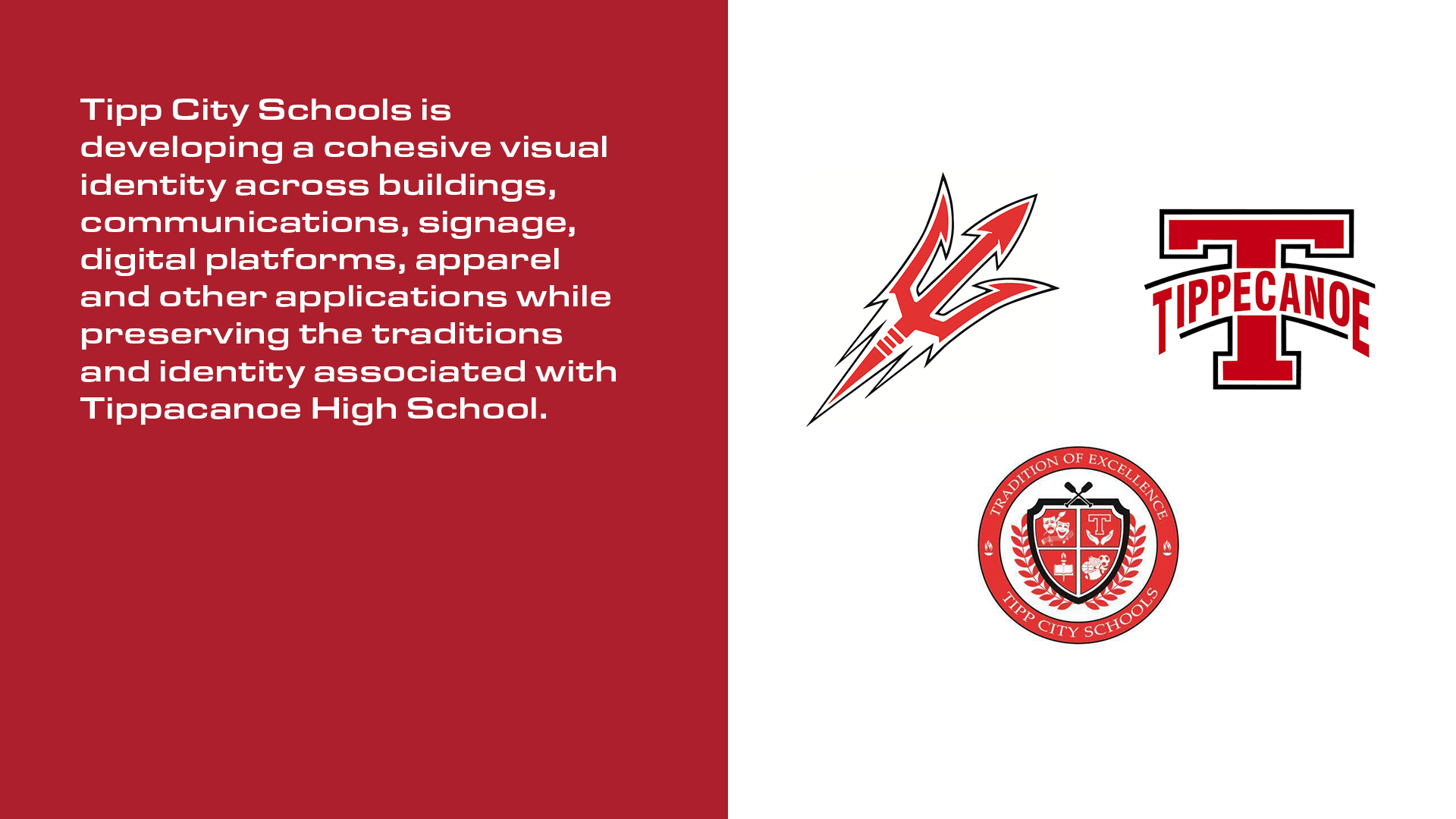
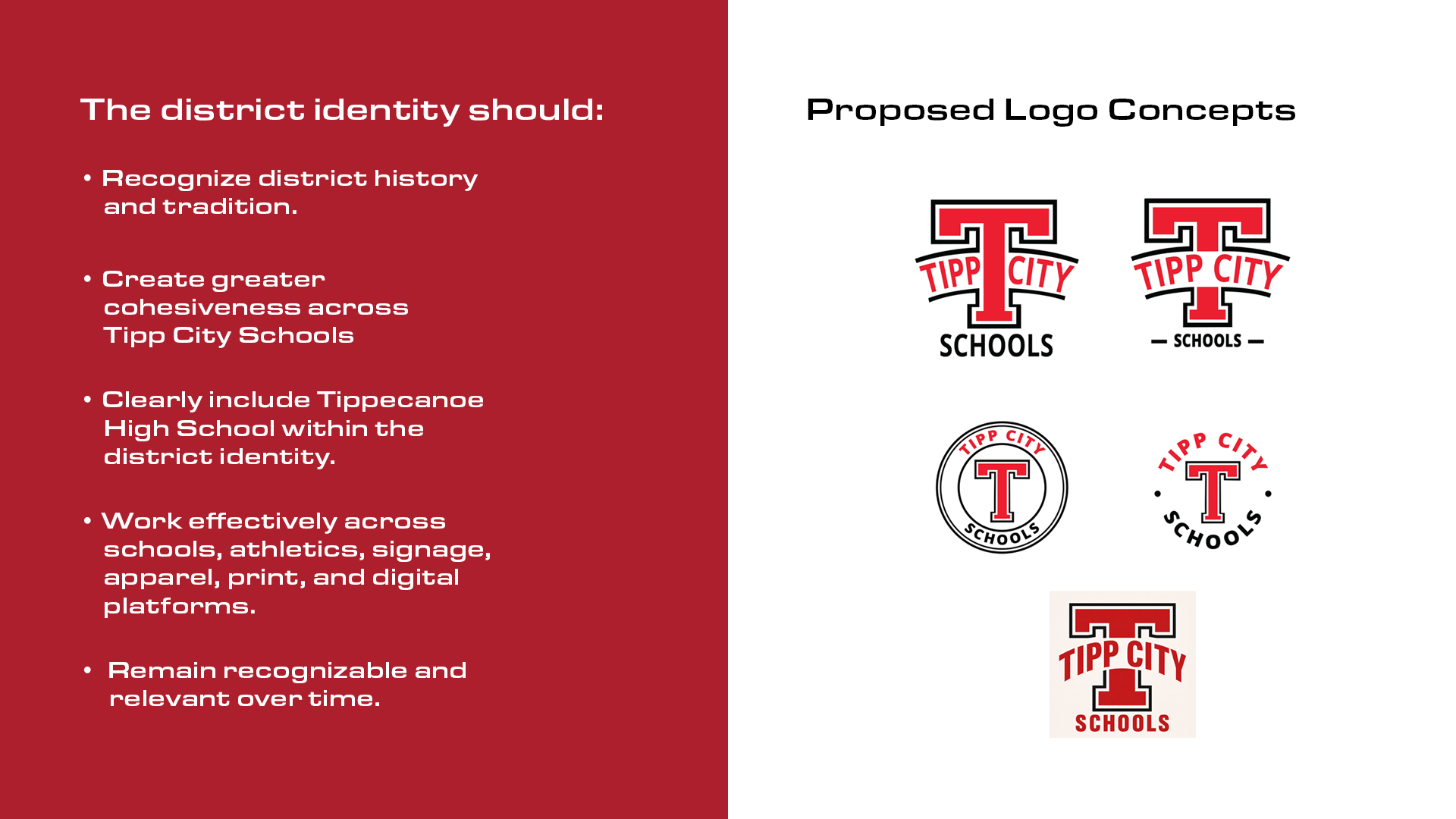
You can see the original project brief, including the proposed district logo concepts, HERE.
In summary, the district identity should:
Recognize district history and tradition.
Create greater cohesiveness across Tipp City Schools.
Clearly include Tippecanoe High School within the district identity.
Work effectively across schools, athletics, signage, apparel, print, and digital platforms.
Remain recognizable and relevant over time.
After twenty years in the graphic design industry, I had three immediate observations:
1) The concepts needed more development before the community could meaningfully evaluate them as visual identity systems. As with any visual identity system, a logo by itself is a fraction of the system around it.
2) Small variations in design do not necessarily qualify as unique “concepts.” The five logo concepts presented by the district appear to represent two underlying ideas: A) two variations of the circular emblem and B) three variations of the curved wordmark through the T.
3) From the district’s brief, it was difficult to parse a clear why for a separate district-wide identity. With the construction of a new PK–8 school building, the need for a visual identity system is obvious. Room numbers, directional signage, paint colors, etc. But many of those design rules are already established within the high school.
What needs to change, and what should carry forward?
A refreshed district identity could strengthen the connection among its schools. But without clear distinctions, it could also create confusion about which identity belongs to the district and which belongs to each school.
Is the district asking for a public-facing visual identity that extends across its schools? Based on the brief, my assumption is yes. There are good reasons both for and against this approach.
In response to the district’s newsletter, the public was concerned about Tippecanoe High School losing its name. The administration clarified that it had not recommended changing the high school’s name. This misunderstanding illustrates the importance of brand distinction. It’s especially important to articulate how the district and school identities would relate to one another.
Problem 1
The new school building needs a name and visual identity system before officially opening.
A) What should the name of the new school be?
B) Should the new school reflect the refreshed visual identity of the district, or the existing identity of the high school?
Solution A — A naming convention that works
Strengthen “Tippecanoe” as the locally unifying term across all entities.
From the outside looking in, “Tipp” is the short name everyone else calls us.
“We’re playing Tipp this weekend.”
Not “We’re playing Tippecanoe this weekend.”
TIPP can function as a secondary wordmark or nickname, but the full name of Tippecanoe unlocks the uniformity the district is hungry for.
Under this approach, Tippecanoe Schools becomes the umbrella for Tippecanoe High and Tippecanoe PreK–8.
This would preserve and strengthen the historic name, establish a consistent naming convention for current and future buildings, and create scalability within the visual design system.
Tippecanoe Preschool. Tippecanoe Trades. Tippecanoe Technology Center. Tippecanoe Schools Bus Maintenance Facility. Etc.
As for naming the new PK–8 building, it’s better to be clear than cute. Learning Center or Academy sound aspirational, but don’t immediately tell people which ages the school serves or whether it’s public or private. That clarity matters especially for new Tipp City residents.
Solution B — Scale the high school visual identity, but fix it first
The foundation of the high school’s visual identity does not seem to be problematic. The culture, colors and iconography are well-established.
In my experience as a parent, continuity is less consistent in classroom communication. Teacher-to-parent communication styles are not clearly unified. That may point to a need for shared templates, guidelines and training rather than a new visual identity.
Before investing in a redesign, it’s worth asking how much could be accomplished by making the existing system easier to use consistently.
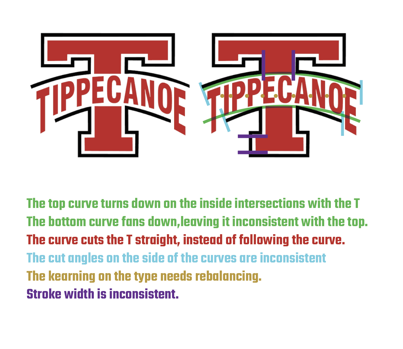
However, the existing Tippecanoe High School logo has a few construction flaws that should be addressed before scaling it across the entire district.
Problem 2
The district needs a logo that is similar to, but distinct from, those of its local schools. It’s worth debating whether the existing crest already accomplishes this goal.
Solution 1 — Retain the district crest
The district newsletter, social media and other channels need to distinguish themselves from school-specific communication. To my eye, the existing crest already accomplishes this without competing with the public-facing identity of each school.
The crest could be modernized without losing its historical value or function.
The existing crest also looks like an apple when it’s small. A clever accident?

Solution 2 — Design a district logo that is familiar but distinct
A refreshed district logo that shares visual elements with its schools could strengthen those connections and establish an integrated identity within the community.
A familiar—but not identical—design would allow the district to remain recognizable as a separate entity with its own related responsibilities.
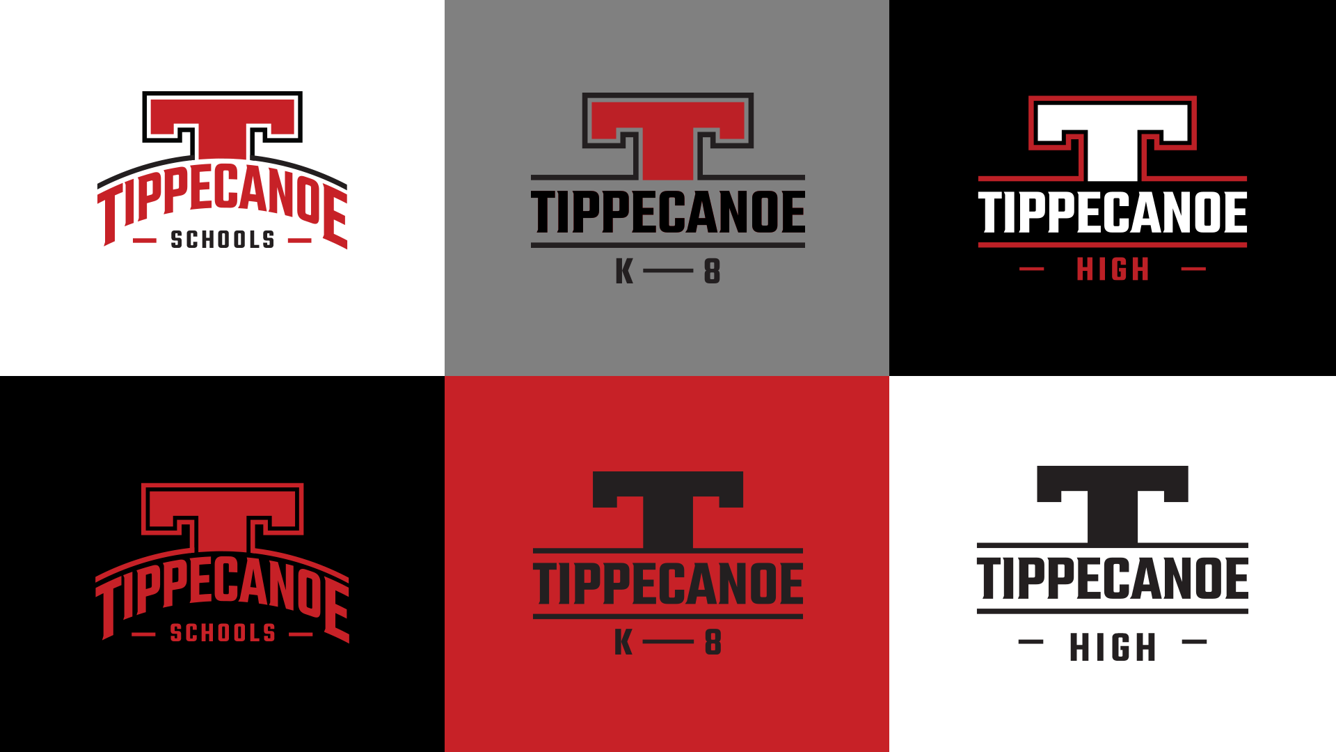
The district logo retains the curve, symbolizing the district as the umbrella or “overarching” agency of its network of schools. The construction flaws of the Tippecanoe High School logo were avoided by reconstructing it on a flat grid.
Problem 3
To honor the community’s participation in the feedback process, the district needs to show how its initial concepts work beyond simple logos.
Solution — Mockups
I offer better input and make my best decisions when I have access to the most context. A further exploration of the district’s logo concepts as fully developed visual identity systems would better equip me to contribute useful feedback to the public discussion.
A case study…
If I were starting from scratch, what might a Tipp City Schools visual system look like, and how would I present it to the public?
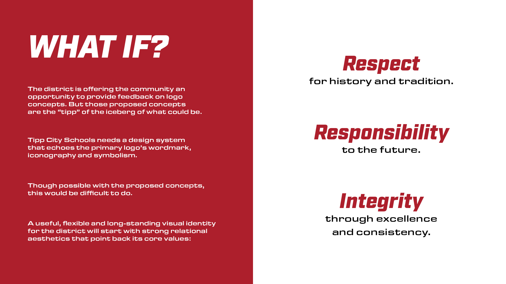
I started with the district’s three core values—Respect, Responsibility and Integrity—and used the relationship between them to establish a simple triangular geometry.
Respect for history and tradition.
Responsibility to the future.
Integrity through excellence and consistency.
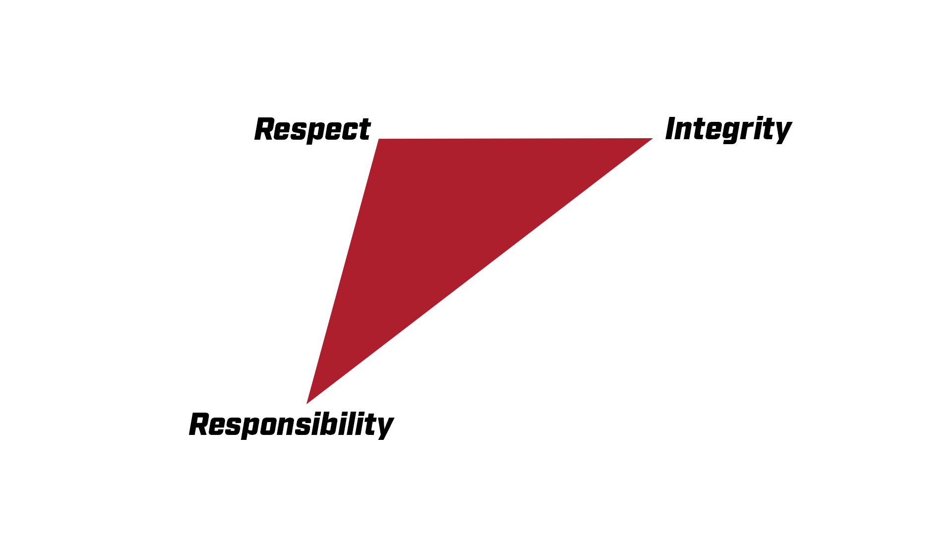
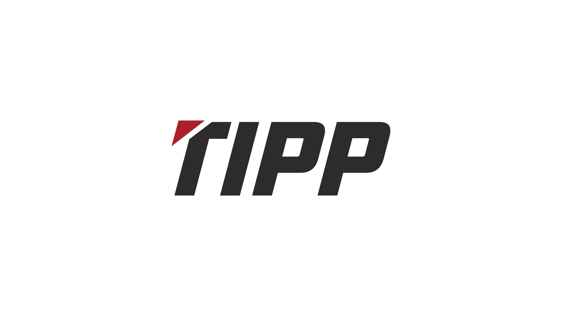
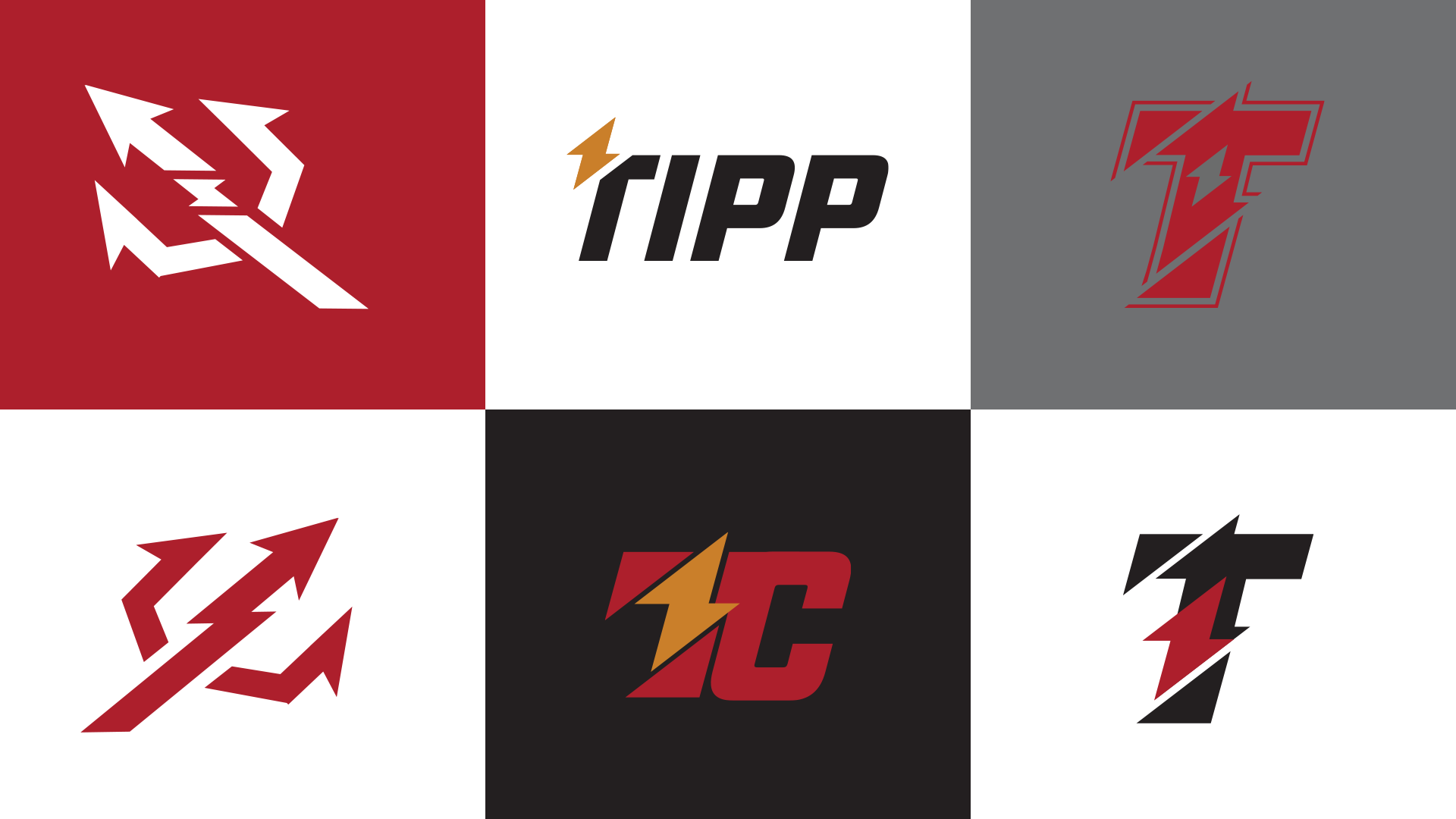
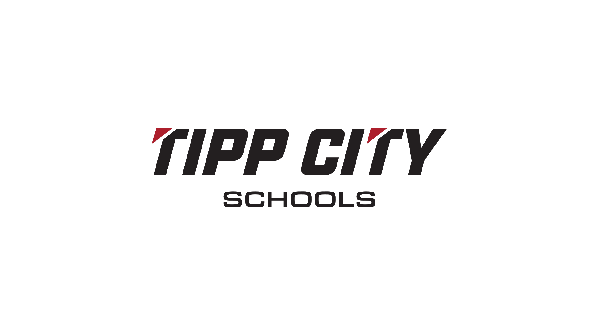
From there, I explored how one repeatable visual idea could influence a wordmark, iconography, typography, patterns, the trident and more.
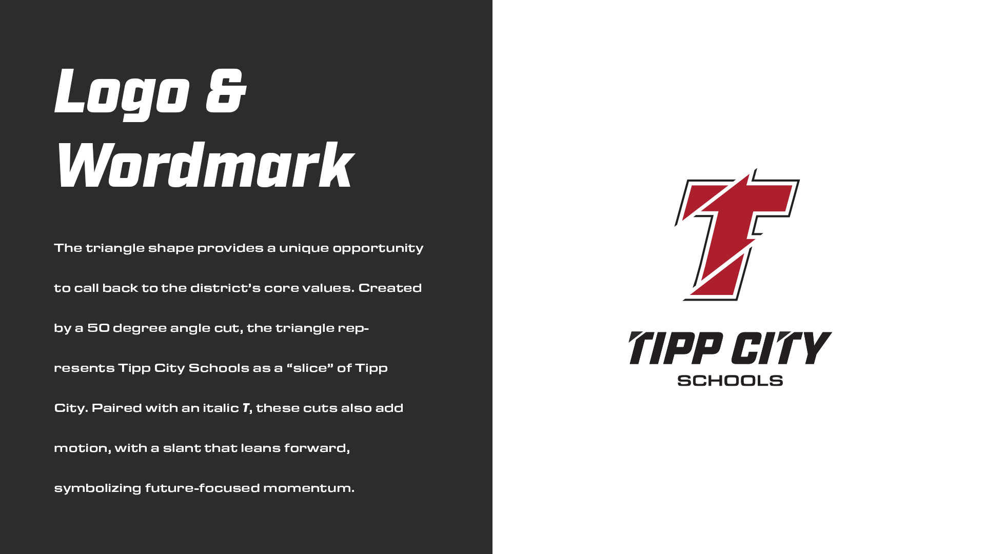
The triangle shape provides an opportunity to call back to the district’s core values. Created by a 50-degree angle cut, the triangle represents Tipp City Schools as a “slice” of Tipp City. Paired with an italic T, these cuts also add motion, with a slant that leans forward, symbolizing future-focused momentum.
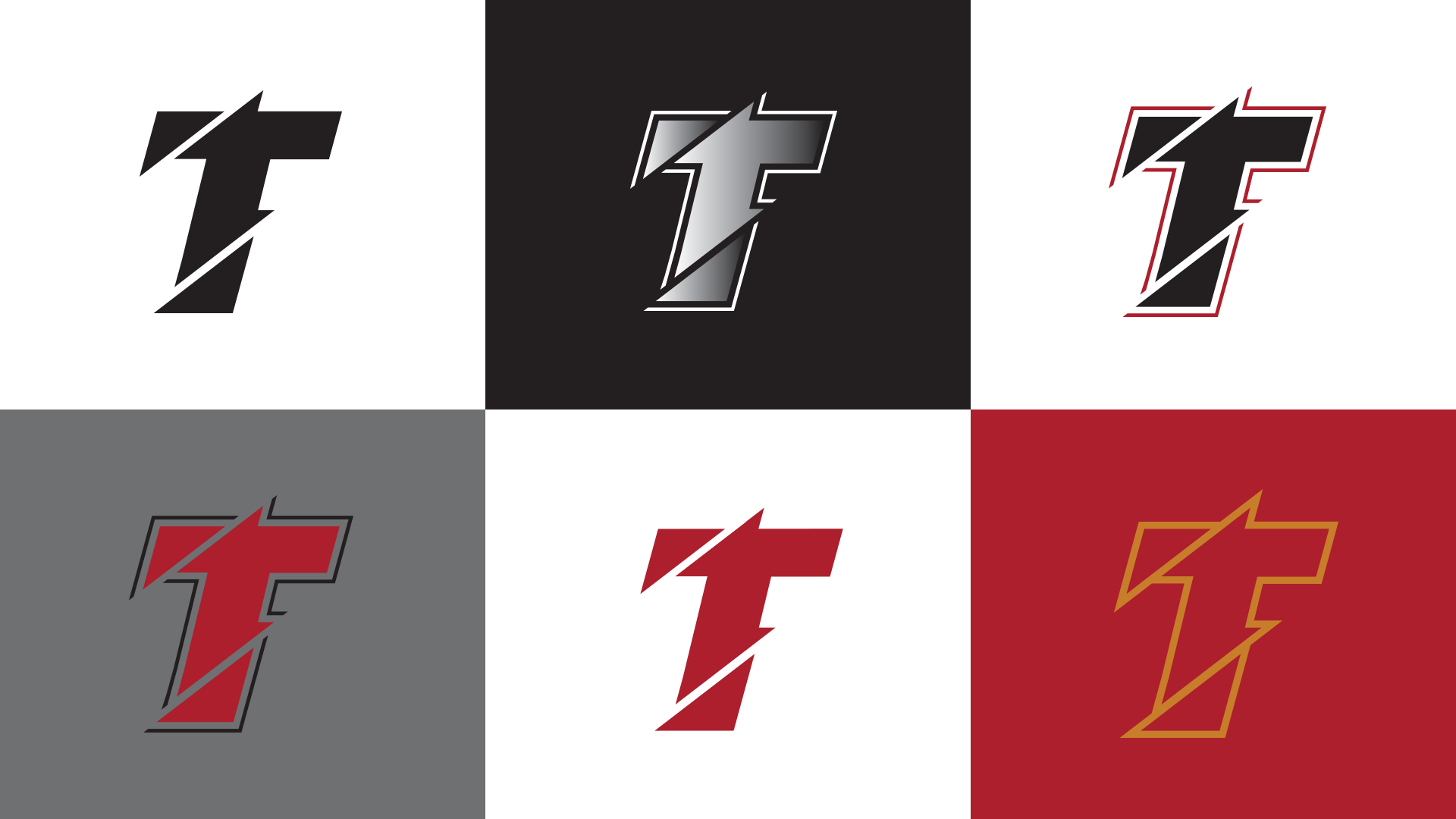
The existing color palette can be broadened. Red, gray, black and white make sense, with red as the primary. But a touch of gold and some gradient can make the gold look shiny and the gray like silver. Silver and gold bring a sense of athletic royalty.
Elements of the trident could be modernized.
As a simple shape, the triangle itself can transform into arrows for wayfinding, patterns for texture, or, in this case, a lightning bolt for the trident associated with Tipp City Athletics.



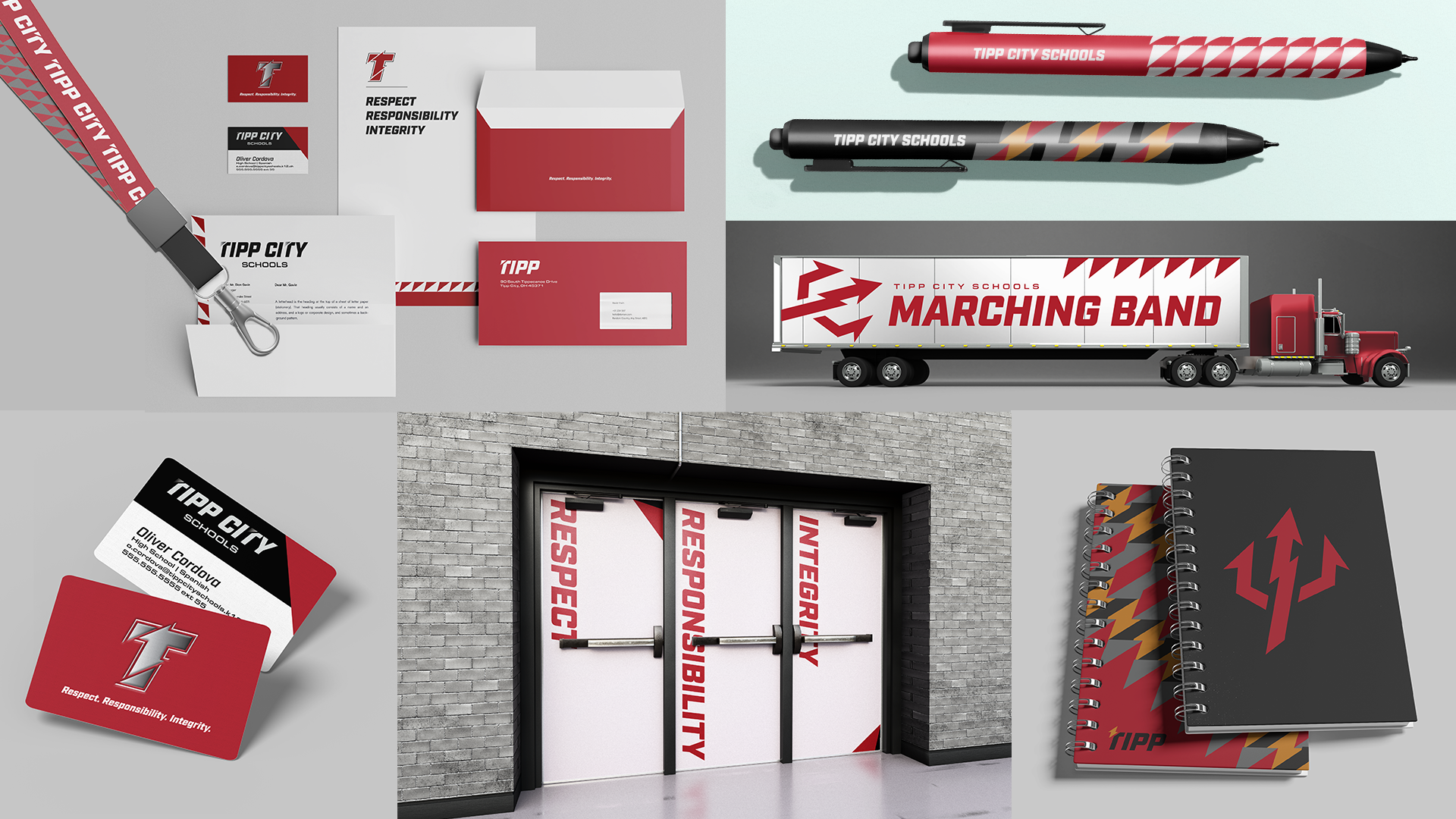

I’m not suggesting this needs to be the solution. I’m suggesting that seeing the proposed concepts developed to this level would make it so much easier for the community to understand—and be excited about—the possibilities and offer useful feedback.
If you know someone in the district office who would appreciate a professional sounding board, tell them I’d love to help. I submitted these ideas during the feedback period and haven’t yet heard how (or if) they fit into the district’s next steps.