Brand Identity Refresh
As a part of my work with Ginghamsburg Church, I’ve had the opportunity to collaborate on many in-kind projects with New Path Compassion Ministries. New Path is a non-profit organization that serves residents of Miami County, Ohio with various needs-based goods and services. One of those operations is a gently-used home goods store in West Milton called,
“The Gleaning Place”
The idea for a brand identity refresh was sparked by the store changing locations. It was an opportunity to order new signs, and re-open in the new location with new energy. The project began with a meeting with the store managers at the new location.
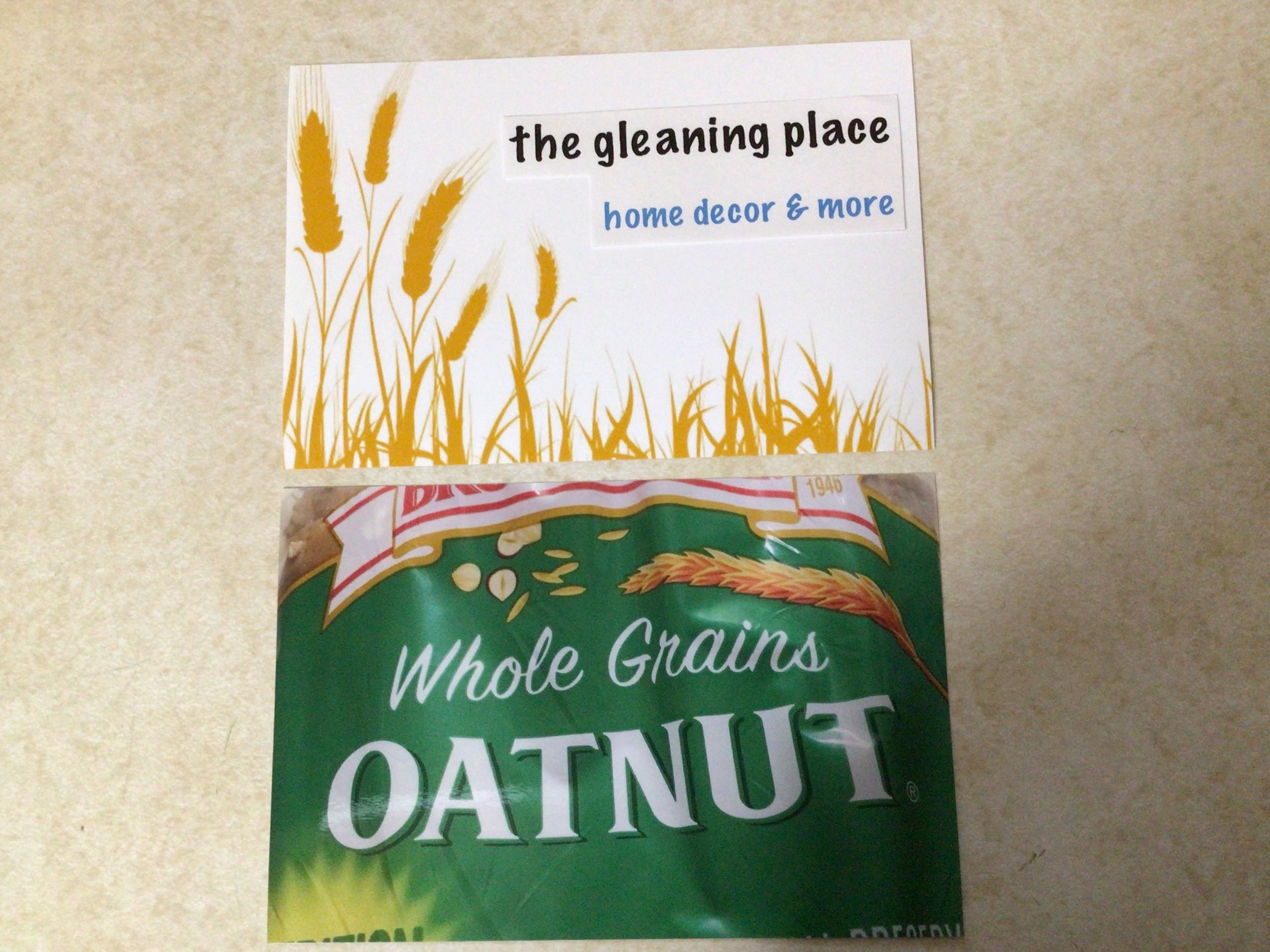
The Original Logo
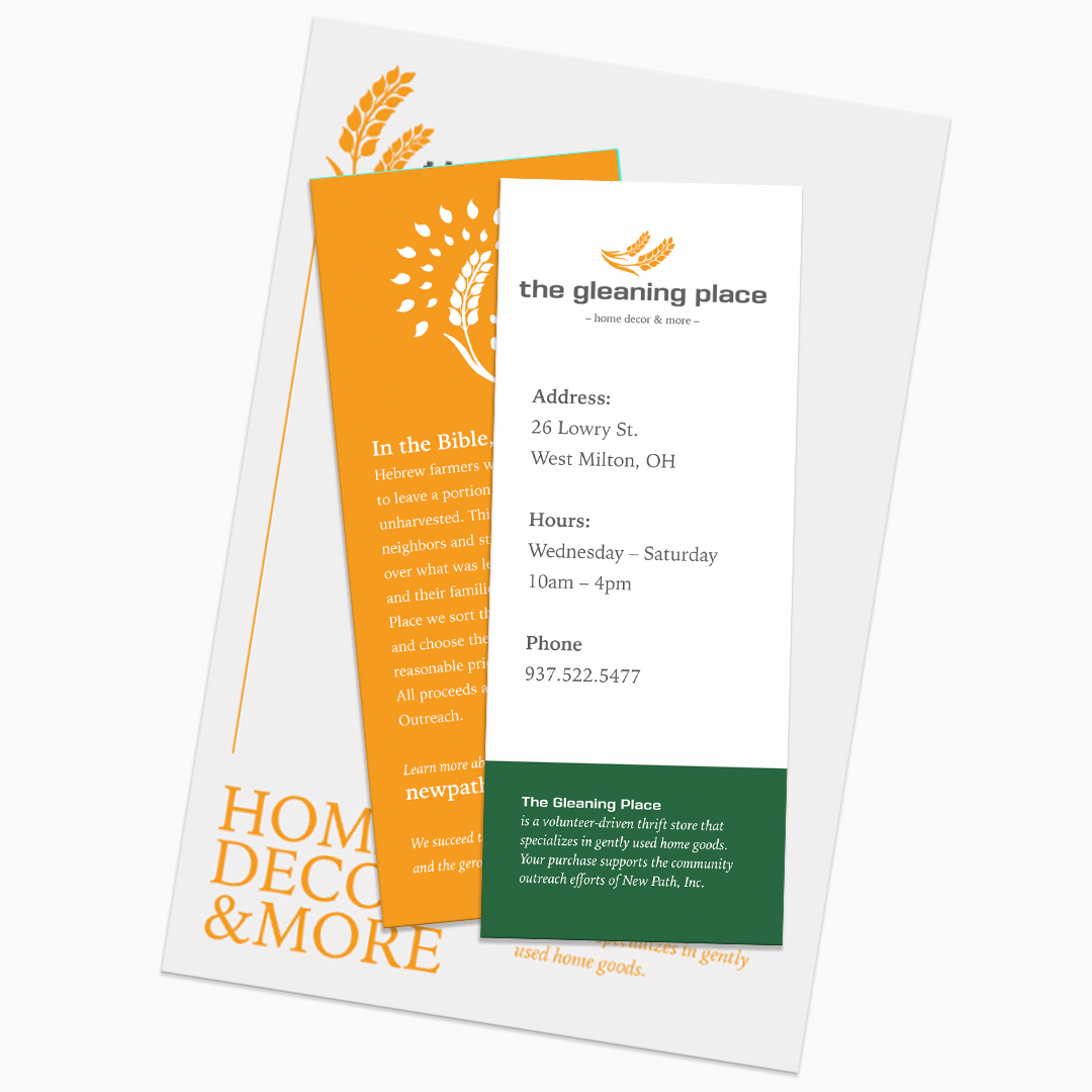
In the Bible, Hebrew farmers were commanded to leave a portion of their crops unharvested to allow poor neighbors and strangers to come onto their land to pick what was left for themselves and their families. Picking leftover crops for the local community was an essential part of farm life and the harvest process for hundreds of years. The original logo was designed to connect the heart of The Gleaning Place with the roots of this important form of social welfare.
After our first meeting, I was excited to explore completely new ideas. Color, modern, simple, adaptable and scaleable were my keywords.
These initial concepts were designed with the customer in mind. The existing customer base may or may not have been familiar with Church and the Bible, but it was assumed that would have no bearing on their choice to “glean” goods from The Gleaning Place. Gleaning, to them, was more representative of “picking the best of what’s available”. The word carried a garage-sale, treasure-hunting cultural attitude. The store managers, however, felt strong ties to the biblical nature of the original symbolism. They presented me with a raw idea of their own, which sparked round 2 of concept design. Wheat was the way.
A Winning Logo and Brand Identity
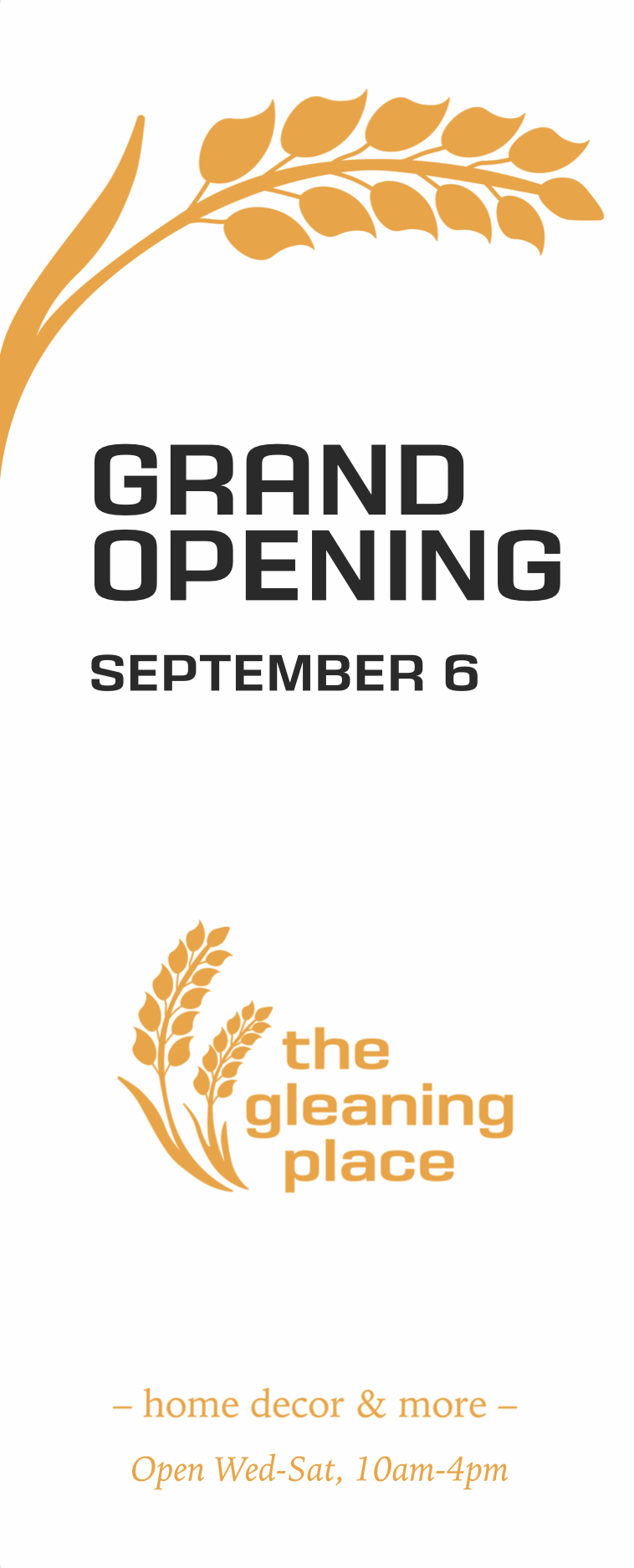
A unanimous agreement gave rise to a new visual identity for New Path’s gently-used home goods store. Wheats of gold, green, red and gray would now welcome curious shoppers to,
“The Gleaning Place”
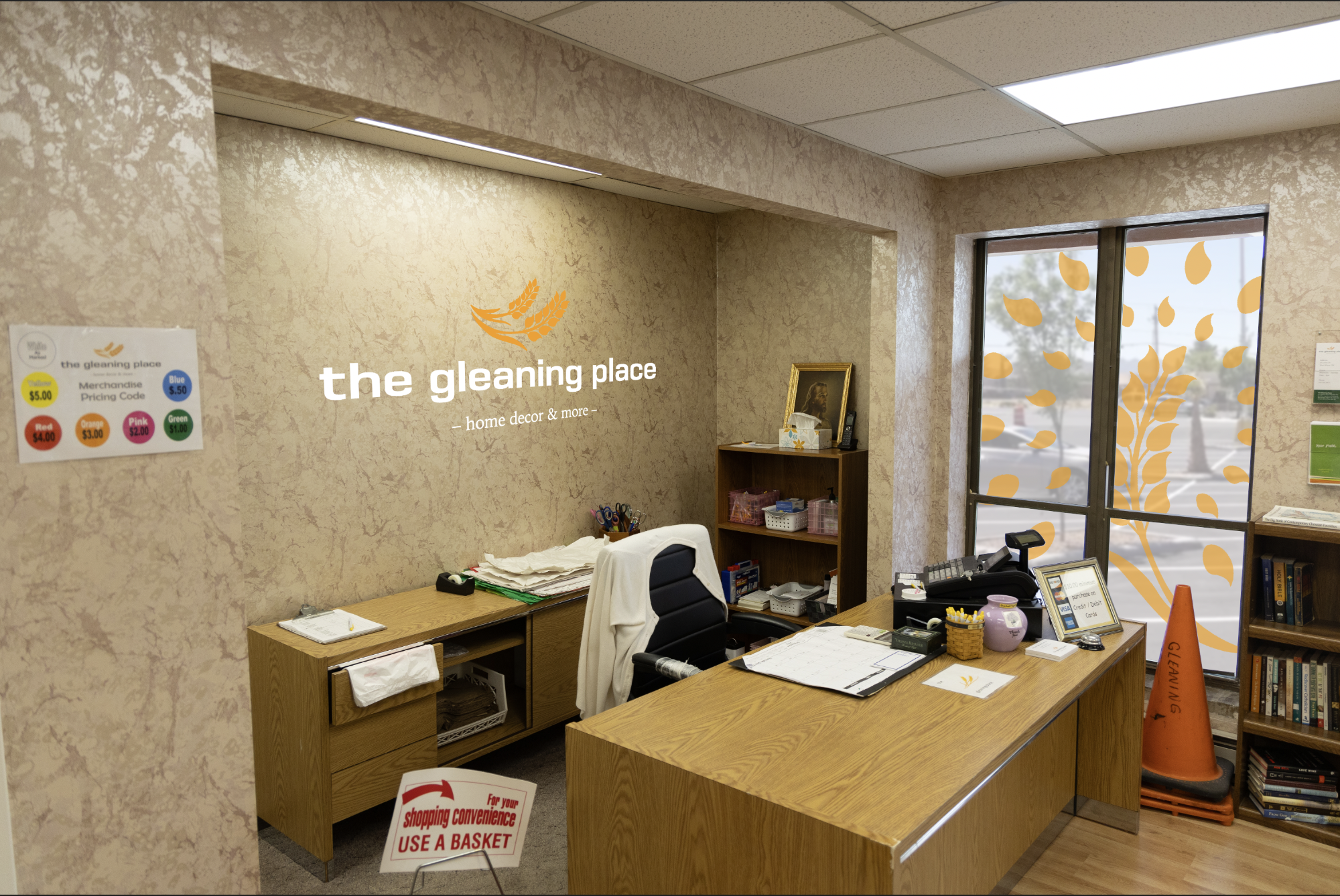
A logo is only part of a much larger visual language. Choosing font family, colors, patterns and other variable designs can add years to the life of a store’s brand. A good logo can also add variety and vibrancy to its daily existence. Wayfinding, product labeling, marketing and decor should all joyfully co-exist within the folds of generously defined design parameters. How can I help you refresh your brand or create something completely new?


