
Brand Identity
Flora Homestead Brand Identity
Shannon and I worked together at Ginghamsburg Church for several years. In fact, she was one of Amy’s bridesmaids in our wedding. When she approached me about designing a baseline identity for her and her husband’s new homestead endeavor, I was excited to get to work. As friends, it didn’t take long to find ourselves on the same page. The Floras came to the table with a solid framework and a good vision. That makes my work easy.


Framework
The Floras had already done some research of their own. With a strong vision already in hand, they provided the following prompt:
“Our packaging is clear/craft paper, grey pulp egg cartons, green pulp berry cartons. Current Fonts we use for labeling are Rockwell (for product title) Century Gothic (for ingredients, address & required info.) Labels are printed on craft paper.”
The Floras provided a mood board, which included a collection of words (natural, organic, vintage), textures (linen, craft paper, watercolor) and colors (greens, blues, charcoal, ivory)
Initial Concepts
As a starting point, I provided three quick sketches that uniquely capture the organic tone expressed in the Floras’ vision.
Upon seeing the different concepts, option B is what ultimately grabbed their imagination.


I used Adobe Firefly to help generate some rudimentary drawings of fruit and vegetables. I vectorized those shapes in Adobe Illustrator, then used the structural reference tool in Firefly to imitate textures of watercolor, which I then integrated with the vector illustrations in Illustrator. These drawings provided flexibility for brand scaling. The Floras also have bee hives, so the hexagon shape offers scalability as well.


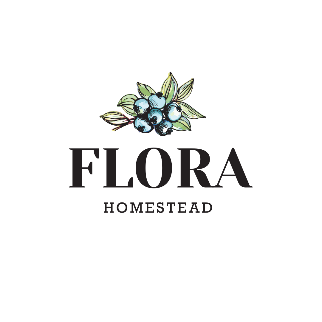
A New Logo and Brand Identity
“Thank you! Thank you! Thank you!
These are so beautiful, I am in tears!”
-Shannon Flora, Flora Homestead
With perfect integration into brand packaging, flexibility to market different products and scalability to grow with their business, the Floras now have a visual identity they can be proud of.


A logo is only part of a much larger visual language. Choosing font family, colors, patterns and other variable designs can add years to the life of a store’s brand. A good logo can also add variety and vibrancy to its daily existence. Wayfinding, product labeling, marketing and decor should all joyfully co-exist within the folds of generously defined design parameters. How can I help you refresh your brand or create something completely new?


